TL;DR:
- Matching fitted furniture to interior style involves aligning proportions, wood tones, and finishes with existing architectural features for a cohesive space. Using no more than three wood tones and ensuring consistent temperature and proper contrast prevents visual tension and enhances interior harmony. Planning carefully with physical samples and professional guidance optimizes results and avoids costly mismatches.
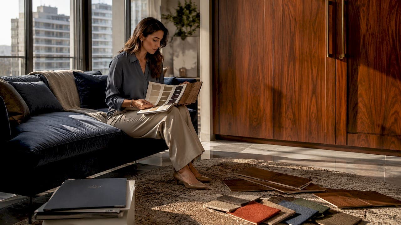
Matching fitted furniture to interior style is defined as the intentional alignment of furniture proportions, wood tones, and textures with a room's existing architectural features and design elements. Get it right, and your space feels considered and cohesive. Get it wrong, and even expensive furniture can look out of place. According to the American Society of Interior Designers, harmonious furniture matching makes an interior feel up to 30% more luxurious. That figure reflects something most homeowners sense but rarely articulate: the difference between a room that looks assembled and one that looks designed. The Rule of Three for wood tones, visual weight, and colour temperature are the core standards that separate the two outcomes.
How to match fitted furniture to interior style: key principles
Before you choose a single panel or finish, you need to understand what already exists in your room. Fitted furniture design does not happen in isolation. Every piece responds to the architecture around it.
The most important starting point is your room's fixed elements. These include:
- Mouldings and trims: Ornate coving and deep skirting boards signal a traditional interior. Flat, minimal trims point to a modern or minimalist aesthetic. Your furniture's door profiles and edge details should echo these lines.
- Floor and wall finishes: A warm oak floor sets a warm tone for the whole room. Pale grey tiles or white-washed walls create a cooler base. Both demand different furniture responses.
- Lighting orientation and colour temperature: North-facing rooms receive cool, flat light. Warm-toned furniture compensates well here. South-facing rooms with bright, golden light can carry cooler finishes without feeling cold.
- Anchor elements: Your sofa, bed frame, or kitchen island is the room's visual anchor. Fitted furniture must relate to it in scale and tone, not compete with it.
Visual weight and temperature are two concepts that most homeowners overlook entirely. Visual weight refers to how heavy or light a piece appears, regardless of its actual mass. A dark, solid wardrobe in a small room reads as heavy and can make the space feel compressed. Visual temperature refers to whether a material reads as warm (amber oak, honey pine, terracotta) or cool (ash, grey lacquer, slate). Mismatching these two properties causes furniture to clash even when the style looks similar on paper.
Pro Tip: Photograph your room in natural daylight and in artificial evening light. The same furniture sample can read entirely differently under each condition. Always assess your shortlisted finishes in both.
What is the Rule of Three for wood tones in fitted furniture?
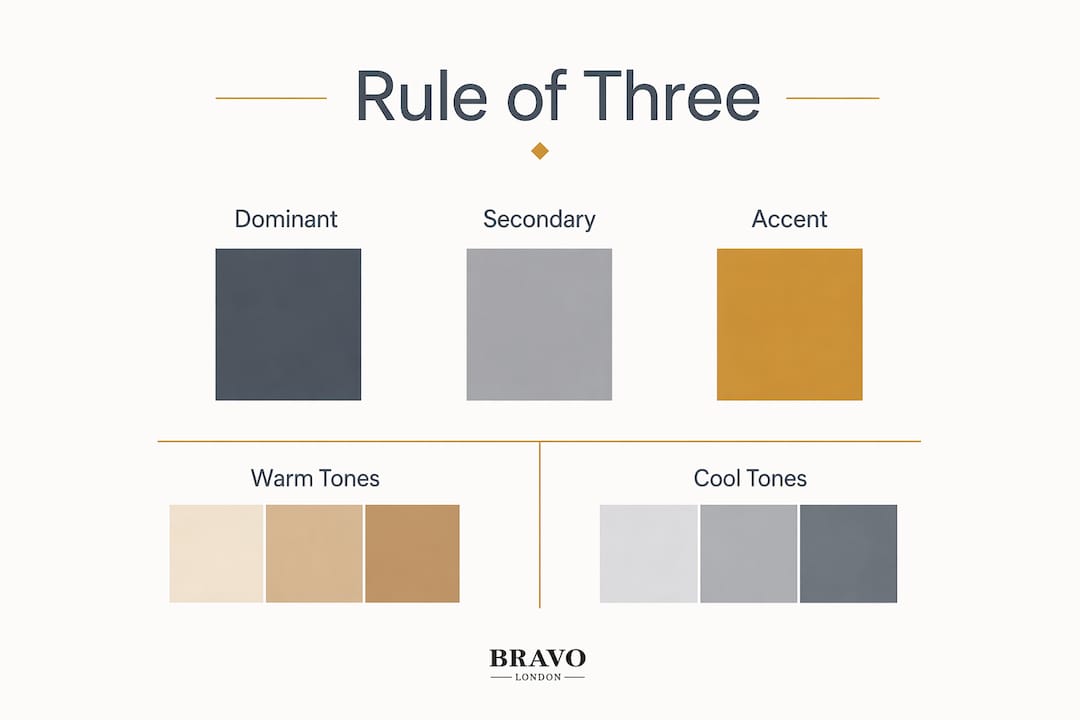
The Rule of Three is a professional design standard that recommends using no more than three wood tones in any single room: dominant, secondary, and accent. This framework prevents visual chaos and keeps a room feeling warm or cool rather than confused.
Here is how each role works in practice:
| Role | Definition | Example |
|---|---|---|
| Dominant tone | The largest surface area of wood in the room | Oak engineered floor covering the full room |
| Secondary tone | The next largest wood presence, typically fitted furniture | Walnut wardrobe or cabinetry |
| Accent tone | A small, deliberate contrast used in hardware or detailing | Cherry wood drawer handles or a side table |
The key discipline is temperature consistency. Warm woods (oak, walnut, cherry, pine) belong together. Cool woods (ash, maple, painted MDF in grey or white) form a separate family. Mixing a warm dominant tone with a cool secondary tone creates a subtle but persistent visual tension that most people feel without being able to name.
A practical example: an oak floor (dominant, warm) pairs well with a walnut fitted wardrobe (secondary, warm) and a cherry accent in a small piece of furniture or hardware. What does not work is pairing that same oak floor with a grey ash wardrobe and then adding a warm cherry accent. The temperature conflict undermines the whole scheme.
Subtle contrast is healthy. Furniture should differ by at least 2–3 shades from the floor to create intentional contrast. Matching the floor tone exactly causes the furniture to disappear visually, which reads as accidental rather than designed.
Pro Tip: Bring physical samples of your floor and wall finishes to any furniture consultation. Digital photographs shift colour significantly. Physical samples give you an accurate read on tone and temperature.
Which finishes and styles suit common interior aesthetics?
Matching fitted furniture with built-in finishes creates a cohesive look that reads as "designed" rather than "assembled." The finish you choose carries as much visual weight as the wood tone itself.
Traditional interiors
Traditional rooms feature ornate mouldings, panelled walls, and period architectural details. Fitted furniture here works best with raised panel doors, in-frame construction, and warm wood veneers or painted finishes in heritage colours. Matte and eggshell finishes suit this aesthetic far better than high gloss, which reads as too contemporary against period details.
Modern and minimalist interiors
Clean lines, flat surfaces, and minimal ornamentation define these spaces. Handleless cabinetry, slab doors, and lacquered finishes in white, grey, or soft black integrate naturally. High gloss works well in spaces with strong artificial lighting. Matte lacquer suits rooms where you want texture to recede and form to lead.
Transitional interiors
Transitional rooms blend traditional architecture with contemporary furniture. This is where the Rule of Three becomes especially useful, because you are deliberately bridging two temperature families. The safest approach is to let the architecture lead in style and let the furniture lead in simplicity. Shaker-style doors in a painted finish sit comfortably in both worlds.
Here is a quick reference for style-to-finish pairings:
- Traditional: Raised panel doors, warm veneers, eggshell or matte paint, antique brass hardware
- Modern: Slab doors, lacquered or foil finishes, handleless rails, chrome or brushed steel hardware
- Transitional: Shaker doors, painted finishes in neutral tones, cup handles in brushed nickel
- Minimalist: Flat-front doors, integrated handles, ultra-matte finishes, no visible hardware
Proportion matters as much as finish. A statement piece should lead without overpowering the architecture or existing key pieces. A floor-to-ceiling wardrobe in a room with low ceilings amplifies the height. The same piece in a room with high ceilings and ornate coving can look undersized if the door profiles are too simple.
What practical steps help homeowners plan fitted furniture that matches their interior?
Planning is where most mismatches are prevented. The decisions you make before you contact a furniture maker determine whether the result feels considered or accidental.
Follow these steps in order:
- Measure the space accurately. Record ceiling height, alcove depths, and any chimney breast or structural protrusions. These dimensions dictate what proportions are possible.
- Catalogue your fixed elements. Note the floor material and tone, wall colour, skirting board height, and any architectural features such as coving or dado rails.
- Identify your dominant wood tone. This is almost always the floor. Every subsequent choice responds to it.
- Select your secondary tone using the Rule of Three. Choose a fitted furniture finish that sits within the same temperature family as your dominant tone, with at least a 2–3 shade difference.
- Choose your accent. This can be hardware, a contrasting shelf edge, or a small piece of freestanding furniture. Keep it to one accent tone only.
- Test samples in the room. Place physical finish samples against your floor and walls in both daylight and evening light before committing.
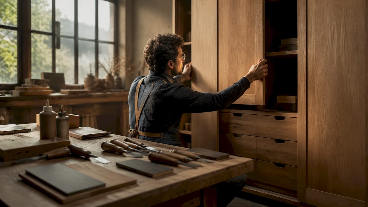
- Consult a specialist for joinery and finish decisions. Bespoke joinery provides full design control and precise fitting, which is particularly important in rooms with irregular walls or high-visibility architectural features.
Common pitfalls to avoid:
- Exceeding three wood tones in a single room
- Choosing a furniture finish that matches the floor exactly
- Ignoring the colour temperature of your lighting when assessing samples
- Selecting door profiles that conflict with your room's architectural trim style
- Scaling furniture incorrectly for the room's ceiling height and floor area
Working with a kitchen and bathroom designer or interior specialist early in the process saves significant cost and rework later. Intentional misalignment of proportions, textures, and colours is one of the most common causes of costly rework in fitted furniture projects.
Key takeaways
Matching fitted furniture to your interior style requires intentional alignment of wood tones, proportions, and finishes with your room's fixed architectural elements, guided by the Rule of Three.
| Point | Details |
|---|---|
| Rule of Three | Use no more than three wood tones per room: dominant, secondary, and accent. |
| Temperature consistency | Keep warm and cool wood tones within the same family to avoid visual tension. |
| Shade contrast | Fitted furniture should differ by at least 2–3 shades from the floor to read as intentional. |
| Proportion and scale | Match door profiles and furniture height to your room's architectural trim and ceiling height. |
| Sample testing | Always assess finish samples in the room under both daylight and artificial light before deciding. |
What I have learned from over 1,000 fitted furniture projects
The most common mistake I see is homeowners focusing entirely on style labels. They decide they want a "modern" wardrobe or a "traditional" dresser, then search for something that fits that label. The label is almost irrelevant. What actually determines whether a piece works is its visual weight, its temperature, and its proportion relative to the room's fixed elements.
I have seen beautifully crafted furniture look completely wrong because the door profile conflicted with the skirting board style, or because a warm oak piece was placed against a cool grey wall with no transitional element to connect them. The furniture was not the problem. The alignment was.
The other thing I have come to believe strongly is that blending styles is not a problem, provided you are deliberate about it. A transitional interior that mixes period architecture with contemporary fitted furniture can look extraordinary. The key is letting one element lead. If the architecture is traditional, let the furniture simplify. If the architecture is neutral, the furniture can carry more character.
Bespoke fitted furniture gives you the control to make these decisions precisely rather than compromising to fit a standard size or finish range. That control is what separates a room that feels designed from one that feels assembled. Invest in the planning stage. The physical result will reflect it.
— Bravo
Bravo London's approach to style-matched fitted furniture
Bravo London specialises in bespoke fitted furniture built to match your interior's exact proportions, wood tones, and architectural details. Every project begins with a detailed assessment of your room's fixed elements, so the furniture responds to what is already there rather than competing with it.
With over 1,000 completed projects and a 10-year warranty, Bravo London applies the Rule of Three and visual temperature principles to every commission. From bespoke fitted wardrobes with precisely matched veneers to cabinetry that echoes your room's moulding profiles, every detail is considered. If you are ready to fit furniture to your decor with confidence, speak to the Bravo London team about a tailored consultation.
FAQ
What does it mean to match fitted furniture to interior style?
Matching fitted furniture to interior style means intentionally aligning the furniture's proportions, wood tones, and finishes with the room's existing architectural features and design elements. The goal is a space that feels designed rather than assembled.
How many wood tones should a room have?
The Rule of Three recommends no more than three wood tones per room: a dominant tone, a secondary tone, and an accent. Exceeding three tones creates visual chaos and undermines cohesion.
Should fitted furniture match the floor exactly?
No. Furniture should differ by at least 2–3 shades from the floor to create intentional contrast. An exact match causes the furniture to blend into the floor visually, which reads as accidental rather than considered.
What is visual temperature in furniture design?
Visual temperature refers to whether a material reads as warm (oak, walnut, amber tones) or cool (ash, grey lacquer, white). Keeping warm and cool tones consistent within a room prevents subtle but persistent visual tension.
When should I use bespoke fitted furniture instead of standard options?
Bespoke fitted furniture is the right choice when your room has irregular dimensions, high-visibility architectural features, or when you need precise control over finish, proportion, and wood tone to achieve a cohesive interior.