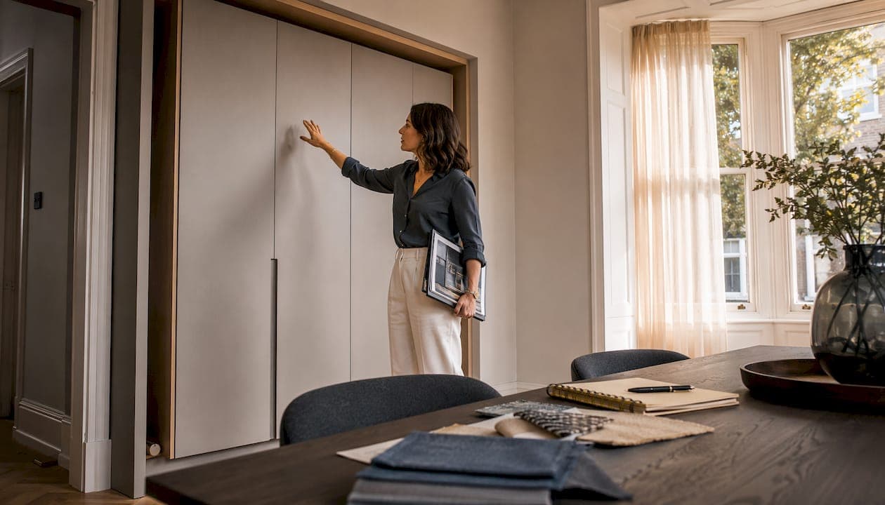
Negative space in fitted furniture is not empty area left over after the cabinetry goes in. It is a deliberate design decision: the intentional empty areas around and between bespoke pieces that frame what you have chosen, guide the eye, and give a room its sense of calm. Get it right and your fitted furniture feels curated and considered. Get it wrong and even the most beautiful joinery disappears into visual noise.
The practical benefits are real and immediate:
- Rooms feel larger and more open, particularly in the compact properties common across the UK
- Individual furniture pieces become focal points rather than part of a cluttered backdrop
- Natural traffic flow is preserved, preventing the subtle congestion that makes a room feel tight
- The overall aesthetic reads as considered and luxurious rather than utilitarian
- Bespoke details such as veneered finishes and integrated handles have space to register
Table of Contents
- Why design philosophy and psychology both support negative space
- Common misconceptions homeowners have about using space well
- How to plan fitted furniture with negative space in mind
- How negative space works across different fitted furniture types
- Balancing negative space with your actual storage needs
- Design mistakes that undermine negative space in fitted furniture
- How lighting and materials shape the perception of negative space
- Bravo London's approach to negative space in bespoke fitted furniture
- Fitted furniture designed around space, not just storage
- Key takeaways
- Perspective
- FAQ
Why design philosophy and psychology both support negative space
Negative space functions like silence in music: a deliberate pause that shapes rhythm, tension, and emphasis. Remove it and the composition collapses into noise. The same logic applies to a fitted bedroom or kitchen. Your eye needs somewhere to rest before it can appreciate what it is looking at.
The Japanese concept of ma captures this precisely. In Japanese design philosophy, ma treats empty space as charged and essential, not as a gap waiting to be filled but as an intentional pause that accentuates the craftsmanship surrounding it. Applied to fitted furniture, this means the void beside a run of wardrobes or the clear wall above open shelving carries as much design weight as the joinery itself.
Interior designer Jennifer Hunter puts it plainly:
Designer Justine Wolman reinforces the point from a practical angle, noting that negative space lifts bespoke details from merely full to genuinely curated. The psychological effect is measurable in how a room feels to live in: balanced, calm, and intentional rather than crowded and exhausting.
Common misconceptions homeowners have about using space well
The most persistent mistake is treating every unfilled inch as wasted money. If you have paid for a bespoke fitted wardrobe, the instinct is to pack in as many shelves, drawers, and rails as the carcass will hold. The result is a unit that functions adequately but looks no different from flat-pack storage.
Most people instinctively try to fill every space, which undermines the very quality that makes bespoke furniture worth commissioning. Good design treats negative space as a compositional subject with its own shape and visual weight, equal in importance to the cabinetry itself.
Common misconceptions worth addressing directly:
- "Empty space is wasted space." Negative space actively improves emphasis on custom furniture and increases its perceived value.
- "More storage means better value." Overcrowding degrades both the aesthetic and the practical function of fitted pieces.
- "Small rooms cannot afford breathing room." Leaving intentional gaps in a compact room makes it feel airier, not smaller.
- "Negative space looks unfinished." Restraint reads as confidence; clutter reads as indecision.
Pro Tip: Before finalising your fitted furniture layout, identify the two or three pieces or details you most want to stand out. Then protect the space around them. Everything else is secondary.
How to plan fitted furniture with negative space in mind
A structured approach prevents the common trap of designing storage first and hoping the room still breathes afterwards.
- Audit how you actually use the room. Before drawing a single cabinet, spend a week noting where you walk, where you pause, and what you reach for most. Your layout should reflect real behaviour, not an idealised version of it.
- Define the room's primary function. A bedroom fitted with floor-to-ceiling storage on every wall serves storage but not sleep. Decide what the room is for, then let that decision govern how much fitted furniture it needs.
- Treat negative space as a design element, not a leftover. Technical drawings that distinguish figure from ground, showing cabinetry and empty space side by side, make it far easier to see whether the balance is right before a single panel is cut.
- Scale furniture to the room. A wardrobe that runs wall to wall in a narrow room may maximise storage but destroys spatial flow. Scaled pieces with deliberate gaps between them often store nearly as much while feeling half the weight.
- Reduce visual noise with integrated details. Recessed handles, push-to-open doors, and hidden mechanisms keep surfaces clean and allow the eye to move across the furniture without snagging on hardware.
- Leave clear walkways. Fitted furniture that forces you to turn sideways creates a choke point. A clear path between facing pieces is a practical minimum in most UK bedrooms.
- Resist filling every surface. Open shelving works best when a portion of the shelf area is left clear. That proportion is not decorative; it is what allows the objects you do display to register individually.
How negative space works across different fitted furniture types
The principle applies differently depending on the piece, but the underlying logic holds across every room.
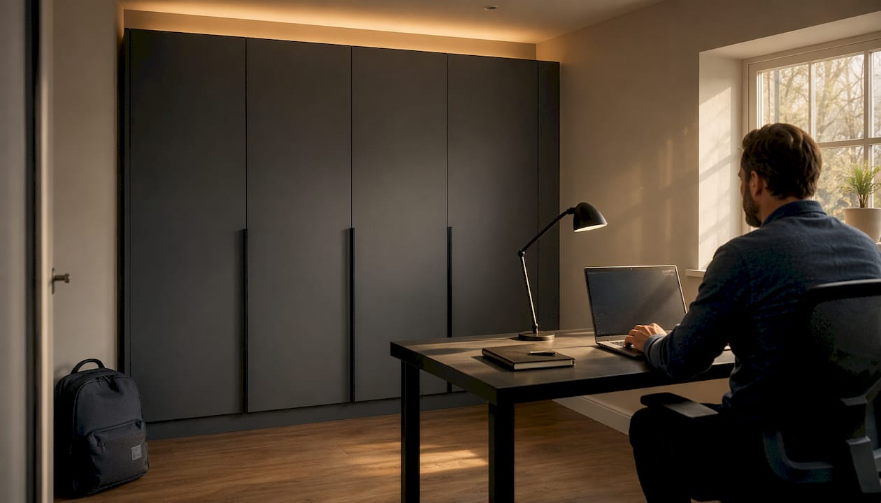
Fitted wardrobes benefit most from restraint at the top. A wardrobe that stops 30cm short of the ceiling reads as furniture; one that runs ceiling-height with a deliberate shadow gap above the cornice reads as architecture. Luxury wardrobe installations often use this gap to integrate lighting, which doubles the spatial effect.
Open shelving and alcove units need breathing room between objects. A shelf packed end to end with books or ornaments reads as storage. The same shelf with grouped objects and clear intervals reads as a considered display. The empty sections are doing the work.
Fitted kitchens present the greatest challenge because function is non-negotiable. The answer is to concentrate negative space where it has the most visual impact: a clear run of worktop between appliances, a single unbroken splashback panel, or a peninsula that floats free rather than connecting to every adjacent wall.
Walk-in wardrobes and dressing rooms are where negative space becomes genuinely luxurious. A fitted walk-in wardrobe with a central island and clear floor space on both sides feels like a boutique. The same footprint packed with rails and shelves on every surface feels like a stockroom.
Balancing negative space with your actual storage needs
The goal is not minimalism for its own sake. You need your fitted furniture to work. The question is how to get the storage you need without sacrificing the breathing room that makes the room feel good.
Start by categorising what you store into daily, weekly, and seasonal. Daily items belong in the most accessible positions, which are typically mid-height and within easy reach. Weekly and seasonal items can go higher, lower, or behind closed doors, freeing the visible portions of your fitted furniture for a cleaner look.
Home organisation planning consistently shows that most households use roughly 70% of their storage capacity regularly. That means 30% of what gets built into fitted furniture is rarely touched. Designing for that 70% and leaving the rest as flexible or open space usually produces a better result than designing for maximum theoretical capacity.
Multipurpose pieces help enormously. A fitted window seat with internal storage, or a bed frame with deep drawers beneath, adds capacity without adding visual mass. The surface reads as negative space even when the interior is working hard.
Design mistakes that undermine negative space in fitted furniture
A few errors come up repeatedly in fitted furniture projects, and most are easy to avoid once you know what to look for.
Inconsistent spacing is the most common. Gaps that vary without reason between units, or margins that shift from one wall to another, create a restless quality that no amount of good joinery can fix. A consistent spacing system, even a simple one, makes the whole installation feel resolved.
Mixing too many finishes fragments the eye. Two or three complementary materials read as a considered palette. Four or more compete for attention and make the negative space feel chaotic rather than calm.
Ignoring the ceiling plane. Most fitted furniture stops at a standard height and leaves an awkward gap above. That gap is not negative space; it is just an unresolved detail. Either run the unit to the ceiling or finish it with a deliberate cornice that makes the gap intentional.
Overcrowding one wall while leaving another bare. Justine Wolman specifically flags this: the goal is visual balance across the whole room, not maximum storage on the most convenient wall.
How lighting and materials shape the perception of negative space
Lighting is the most underused tool in fitted furniture design. A recessed LED strip inside a wardrobe or beneath a floating shelf does two things: it illuminates the contents and it defines the void around the unit. That defined void reads as intentional space rather than shadow.
Matt finishes on cabinetry absorb light and recede visually, which makes the negative space around them feel more generous. High-gloss finishes reflect light and advance visually, which can make the same room feel busier. For rooms where breathing room is the priority, a matt or satin finish on the furniture itself tends to serve the negative space better.
Natural materials such as oak or walnut add warmth without visual weight, particularly when the grain runs horizontally. Glass inserts in cabinet doors create transparency that extends the perceived depth of the negative space behind them. Metal accents, used sparingly, add definition without filling the void.
Bravo London's approach to negative space in bespoke fitted furniture
Restraint is a skill, and it is one that Bravo London has built into its design process across over 1,000 completed projects. The starting point for every commission is a spatial audit: understanding how the homeowner actually uses the room before a single dimension is drawn. That audit shapes not just what goes in, but what stays out.
Bravo London's designers use technical drawings that show negative space explicitly alongside cabinetry, treating the void as a design element with the same status as the joinery. The result is fitted furniture that integrates with the architecture of the room rather than sitting in front of it. Clean lines, integrated handles, and carefully considered shadow gaps are standard features, not upgrades.
The 10-year warranty that backs every installation reflects the same philosophy: furniture built with this level of intention should last, and the spatial decisions made at the design stage should feel as considered a decade later as they do on the day of installation.
Fitted furniture designed around space, not just storage
Bravo London offers bespoke fitted furniture for homeowners who want their rooms to feel as good as they function. The difference from a standard installation is the attention given to what is not there: the deliberate gaps, the clear sightlines, the breathing room that makes a fitted wardrobe feel like part of the room rather than an obstacle in it.
With over 1,000 projects completed across London and the surrounding area, Bravo London brings the same spatial discipline to every commission, whether that is a luxury bespoke wardrobe, a fitted kitchen, or a full joinery scheme for a period property. Every design is backed by a 10-year warranty and built to your exact dimensions and lifestyle. To see how negative space can work in your home, book a design consultation with the Bravo London team.
Key takeaways
Negative space in fitted furniture is a deliberate design tool that frames bespoke pieces, improves room flow, and creates the perception of luxury in any interior.
| Point | Details |
|---|---|
| Negative space is intentional | Empty areas around fitted furniture are a design decision, not leftover room. |
| The ma principle applies | Japanese design philosophy treats void as charged and essential, not wasted. |
| Overcrowding undermines quality | Filling every inch degrades both the aesthetic and practical function of bespoke pieces. |
| Lighting and materials amplify space | Matt finishes and recessed LED strips make negative space feel more generous and defined. |
| Bravo London builds space in | Every commission begins with a spatial audit, backed by over 1,000 completed projects and a 10-year warranty. |
Perspective
The conversation around fitted furniture almost always starts with storage. How many shelves? How many drawers? Can we fit a pull-out rail? These are reasonable questions, but they frame the problem the wrong way around.
The rooms that feel genuinely luxurious, the ones that stop you when you walk in, are rarely the ones with the most storage. They are the ones where every piece of furniture has room to exist. The wardrobe that stands clear of the adjacent wall. The shelving unit with objects grouped rather than crammed. The kitchen with a clear run of worktop that nobody has cluttered with appliances.
What Bravo London understands, and what most homeowners only discover after a project is finished, is that the quality of a bespoke installation is as much about the decisions not to fill space as the decisions to fill it. A fitted wardrobe with integrated handles and a deliberate shadow gap above the cornice does not just look better than one without. It makes the whole room feel better, because the eye has somewhere to rest.
The instinct to fill is understandable. Space costs money, and leaving it empty can feel like a failure of nerve. But restraint, applied with intention, is what separates furniture that functions from furniture that transforms a room.
FAQ
What does negative space mean in fitted furniture?
Negative space in fitted furniture refers to the intentional empty areas around and between bespoke pieces. Rather than leftover room, it is a deliberate design element that frames the furniture, guides the eye, and creates visual balance.
Does negative space make a small room feel bigger?
Yes. Selecting scaled furniture and leaving clear walkways and breathing room makes compact rooms feel airier and more open, even when the total floor area has not changed.
How do I balance storage needs with negative space?
Categorise your belongings into daily, weekly, and seasonal use. Design your fitted furniture around daily-access items and treat the remaining capacity as flexible or open space, which preserves both function and visual calm.
How does Bravo London incorporate negative space into its designs?
Bravo London begins every project with a spatial audit and uses technical drawings that show cabinetry and empty space side by side. Integrated handles, shadow gaps, and scaled proportions are built into every installation, backed by a 10-year warranty.
What design mistakes most commonly undermine negative space?
Inconsistent spacing between units, mixing too many finishes, and overcrowding one wall while leaving another bare are the most frequent errors. Each fragments the eye and makes the negative space feel unresolved rather than intentional.