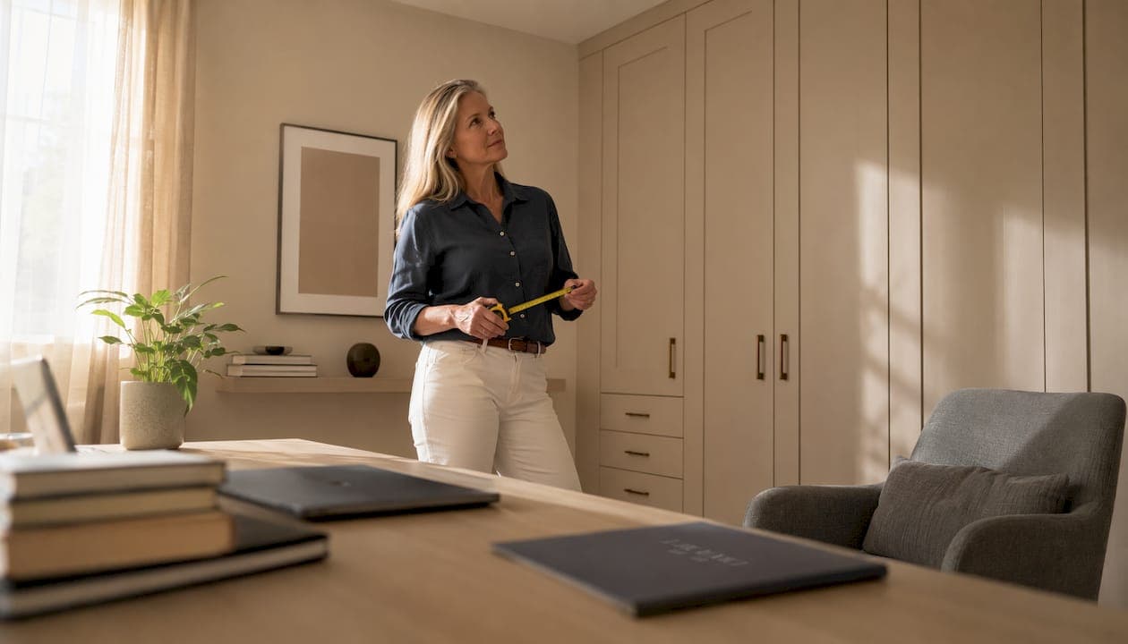
For small rooms, match your wardrobe colour to the walls to reduce visible boundaries and make the space feel larger. For statement pieces in larger rooms, choose a saturated contrast. For cocooning bedrooms, drench every surface in one deep hue. Those three rules cover the vast majority of decisions you will face when choosing interior colour schemes for fitted wardrobes.
Three ready-made palette starters:
1. Soft Cocoon (small bedrooms, north-facing rooms) Warm putty, dusty blush, pale linen, and off-white trim. Match wardrobe doors to walls. Use a matt finish throughout for an architectural, seamless look.
2. Statement Contrast (larger bedrooms, living rooms, home offices) Deep forest green or rich navy wardrobe doors against warm white or pale stone walls. Brass or brushed-gold handles. Pale oak or natural linen interior lining.
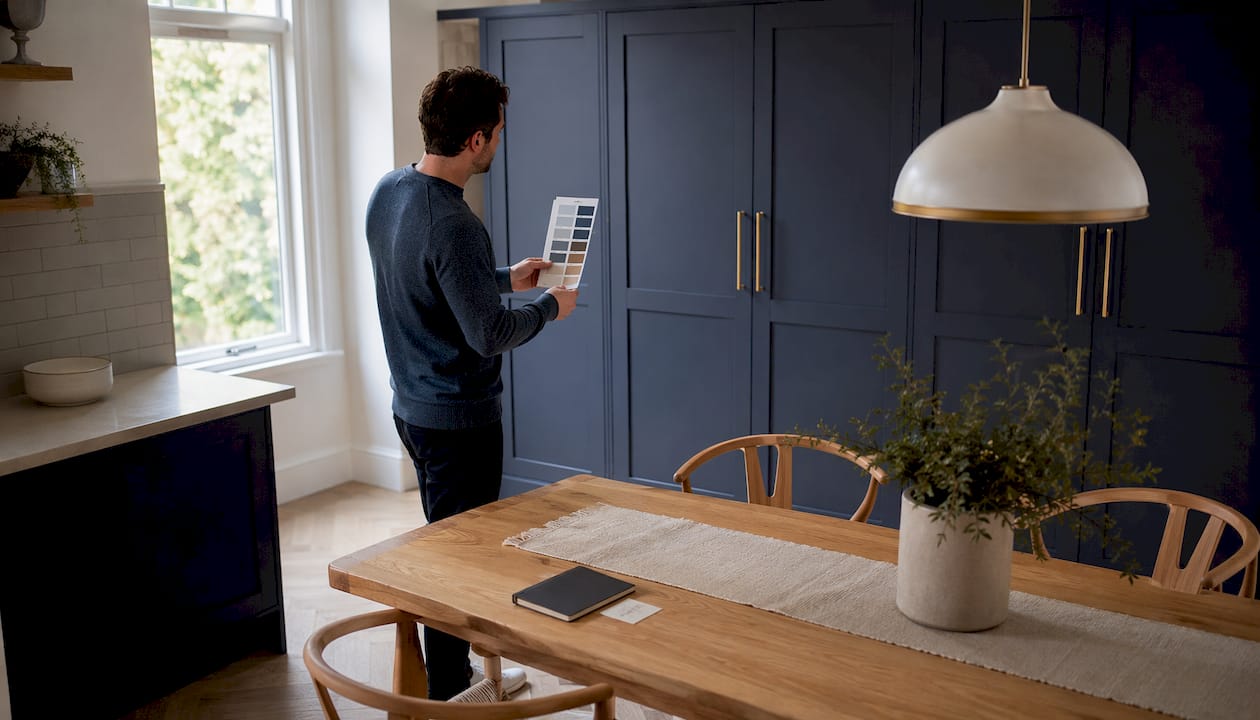
3. Earthy Drench (cocooning bedrooms, loft conversions) Terracotta or muted olive on walls, wardrobe doors, and ceiling. Warm natural wood accents. Satin finish on doors for easy cleaning; matt on walls for depth.
Quick decision rules:
- Match wardrobe to wall for cohesion and to make small rooms feel larger
- Use contrast when you want the wardrobe to read as a piece of furniture, not architecture
- Choose a matt finish to blend with standard emulsion walls; step up to a satin finish in family bathrooms, hallways, or children's rooms where wipeability matters
- Always test a large sample panel in the actual room before committing
Table of Contents
- How does paint finish affect the look and durability of fitted wardrobes?
- What colours work best room by room?
- What core principles should guide any wardrobe colour decision?
- Which colour combinations work best with fitted wardrobes?
- How do colour choices affect perceived room size in small or awkward spaces?
- How do you test wardrobe colours before committing?
- How do materials and finishes interact with colour, and what maintenance is needed?
- What are the trending wardrobe colours for 2026 in the UK?
- How does wardrobe interior colour affect storage visibility and organisation?
- Which colours complement laminate and wood veneer wardrobe finishes?
- Bravo London brings your colour vision to life
- Key takeaways
- The colour mistakes most homeowners make — and how to avoid them
- Useful sources and further reading
- FAQ
How does paint finish affect the look and durability of fitted wardrobes?
Sheen level changes both how a colour reads and how long it lasts. Get this wrong and a beautifully chosen hue can look flat and chalky on a wardrobe door, or conversely, bounce light in a way that makes the room feel clinical.
A matt finish absorbs light in the same way standard emulsion does, so it gives the closest architectural match when you want wardrobe doors to disappear into the wall. The trade-off is that matt surfaces mark more easily and are harder to wipe clean. For living rooms and adult bedrooms where doors are touched infrequently, that is usually acceptable.

A satin finish is the practical choice for hallways, children's rooms, and any wardrobe that gets daily use. It resists fingerprints, wipes clean with a damp cloth, and still reads as a relatively low-sheen surface from a distance. Lacquered or high-gloss finishes sit at the other end of the spectrum: they reflect the most light, intensify colour saturation, and create a distinctly furniture-forward look rather than an architectural one.
Finish options at a glance:
- 10% matt / eggshell: Best architectural match to emulsion walls; suits bedrooms and living rooms with light traffic
- 20–30% satin: Recommended for high-traffic areas; easy to clean without looking shiny
- Lacquered / gloss: High impact, high maintenance; suits statement wardrobes and contemporary kitchens
- Primer choice: MDF and engineered boards need a solvent-based or specialist MDF primer before any topcoat; veneered surfaces require a flexible adhesion primer to prevent delamination
Pro Tip: Use a very slight sheen difference between the wardrobe door frame and the wall. A matt wall with a satin-finish door frame adds subtle depth and definition without breaking the colour match. It is one of the simplest ways to make a fitted wardrobe feel considered rather than flat.
For guidance on painting interior doors and finish choices, the practical principles around topcoat selection apply equally to wardrobe cabinetry.
What colours work best room by room?
Bedroom
The bedroom is where most fitted wardrobe decisions happen, and the range of options is wider than many homeowners expect. For a calm, restful atmosphere, soft muted greens, warm greys, and dusty pinks are the palettes designers return to repeatedly in UK projects. These work particularly well with lacquered doors in a soft sheen, where the slight reflectivity adds a quiet luxury without competing with the rest of the room.
For a more dramatic bedroom, colour drenching — painting walls, trim, ceiling, and wardrobe doors the same hue — makes deep colours feel expansive rather than oppressive. A deep teal or forest green drenched room reads as intentional and sophisticated. The key is removing all stark contrasts between surfaces so the eye travels smoothly around the space.
Bedroom palette ideas:
- Calm: warm grey walls + off-white wardrobe doors + pale oak handles
- Tonal: dusty sage walls + slightly deeper sage doors + brushed brass trim
- Statement drench: deep navy on all surfaces + warm white bedlinen + antique brass handles
Pro Tip: For the ceiling in a drenched bedroom, go one shade lighter than the walls. It lifts the room just enough to prevent the ceiling from feeling low, while keeping the cocooning effect intact.
Living room
Living room wardrobes and fitted storage units need to balance warmth with sociability. Warm neutrals — soft camel, warm white, and pale stone — tend to work well alongside wood floors and mixed upholstery. If you have a strong existing colour in the room (a sofa, a rug), pull a tone from that rather than introducing a new one. Matching fitted furniture to your interior style is covered in depth in Bravo London's practical style guide.
Hallway
Hallways typically have limited natural light and high footfall, which means two things: choose a finish with at least a 20% satin sheen for durability, and lean towards warmer mid-tones rather than very pale colours that show every scuff. Warm stone, soft terracotta, and deep charcoal all work well. Avoid cool whites in north-facing hallways — they tend to look grey and flat without strong daylight.
Loft and attic rooms
Sloped ceilings and irregular wall heights make colour choices more consequential. Matching the wardrobe to the wall and ceiling colour unifies the angles and reduces the visual choppiness of the space. If you want contrast, keep it to the door fronts only and match frames and reveals to the wall.
Home office
Focus and mood matter here. Muted blues, soft greens, and warm mid-tones support concentration without feeling sterile. For the wardrobe interior, use a pale, slightly warm white on shelves and internal panels. It makes contents easier to see and reduces eye strain when you are searching for items during the working day.
What core principles should guide any wardrobe colour decision?
Before you commit to a palette, four principles will save you from the most common mistakes.
Natural light direction matters more than most people realise. North-facing rooms shift colours cooler and can subdue warm undertones, making a warm putty look muddy and a soft green look grey. Compensating with a slightly warmer hue than you think you need, or adding warmer-temperature artificial bulbs, prevents that effect. South-facing rooms amplify warmth and saturation, so colours can be slightly cooler or more muted than you might choose elsewhere.
Door profile changes perceived colour. Flat-panel doors maintain a uniform pigment across the surface because there are no recesses to cast shadows. Shaker profiles introduce subtle mid-tone darkening in the recesses, which adds texture to a monochrome scheme but also means the colour reads slightly darker overall. If you are matching a specific wall colour precisely, flat panels are more forgiving.
Scale affects perceived mass. A floor-to-ceiling wardrobe in a deep colour will read very differently to a half-height unit in the same colour. The larger the wardrobe, the more a dark colour will dominate the room. Test your chosen colour on a large panel, not a small chip.
Undertones in adjacent materials shift the apparent hue. Warm honey-toned oak flooring will pull a grey wardrobe towards green. Cool grey stone tiles will pull a warm white towards yellow. Checking samples next to floor samples and textiles is one of the most reliable ways to catch a near-miss before it becomes an expensive mistake.
A quick checklist for assessing a sample in your room:
- View the sample at morning, midday, and evening under both natural and artificial light
- Hold the sample against the floor, skirting, and any fixed furniture
- Check for undertone clash (does the grey look green? Does the white look yellow?)
- Consider the door profile and how shadows will affect the colour in practice
- Photograph the sample with your phone — cameras often reveal undertone clashes the eye misses
Which colour combinations work best with fitted wardrobes?
Three proven strategies cover most situations.
Tonal schemes layer three related tones from the same colour family. A bedroom might use a pale sage on the walls, a mid sage on the wardrobe doors, and a deeper sage on the interior lining. The result feels sophisticated and deliberate without requiring a bold design decision. The 3-7-2 framework — three neutrals, up to seven main colours, two accents — is a useful structure for keeping a tonal scheme cohesive and avoiding overcomplication.
Contrast schemes pair a deep wardrobe colour with lighter walls, or vice versa. Deep forest green doors against warm white walls is a classic example. The wardrobe reads as a piece of furniture rather than architecture, which works well in larger rooms where you want the storage to make a statement. Rich jewel tones — navy, burgundy, deep forest green — combined with well-matched undertones between the wardrobe and surrounding architecture consistently read as expensive and considered.
Accent strategies use handles, trim metal finishes, and internal lining colours to lift a scheme without changing the main palette. Brushed brass handles on a dark green wardrobe add warmth. A pale blush or warm white interior lining against a deep exterior creates a pleasant reveal when doors open. Mirror fretwork on door panels adds texture and light at relatively low cost.
Combination quick-reference:
- Tonal: pale sage walls + mid sage doors + deep sage interior lining
- Contrast: warm white walls + deep navy doors + brushed brass handles
- Accent-led: neutral grey doors + warm white interior + antique bronze handles + oak shelf edges
How do colour choices affect perceived room size in small or awkward spaces?
Matching wardrobe doors to wall colour reduces visible boundaries and makes a small room feel larger. The eye cannot easily identify where the wall ends and the wardrobe begins, so the space reads as more continuous. This is the single most reliable technique for small bedrooms and narrow hallways.
Deep colours do not automatically make a room feel smaller. Used in a deliberate cocooning approach — the same hue on walls, ceiling, and wardrobe doors with no stark contrasts — a deep terracotta or forest green can feel expansive rather than oppressive. The rule is consistency: it is the contrast between surfaces, not the depth of colour, that creates a cramped feeling.
For alcoves and partial-height wardrobes, continue the skirting board profile and colour across the wardrobe base. This grounds the unit and prevents it from looking like a box sitting in a recess. Colour banding at dado height can also help in rooms with low ceilings by drawing the eye horizontally.
Do and don't rules for small rooms:
- Do match wardrobe to wall for a seamless, space-expanding effect
- Do use a consistent sheen level across wall and door to avoid a patchy look
- Do drench all surfaces in one deep hue if you want a cocooning atmosphere
- Don't use a high-contrast wardrobe colour in a very small room unless the wardrobe is the deliberate focal point
- Don't mix warm and cool tones across surfaces in a small space — undertone clashes feel more pronounced in confined areas
Pro Tip: In a loft room with sloped ceilings, paint the wardrobe, the sloped ceiling, and the knee walls all the same colour. The angles disappear and the room feels like a considered, unified space rather than an awkward shape with furniture in it.
How do you test wardrobe colours before committing?
Testing properly takes a little time but saves a great deal of money. Follow these steps in order.
- Order sample pots and paint a large panel. A 60 × 90 cm board or a full-size door section is the minimum useful size. Small chips mislead because the eye perceives colour differently at scale — a pale grey chip can look almost white, but the same colour across a full wardrobe door reads as a definite grey.
- Test in situ at three times of day. Pin or prop the panel in the actual position the wardrobe will occupy. View it in morning light, afternoon light, and under the room's artificial lighting in the evening. Colours shift significantly between these conditions.
- Check adjacent materials. Hold the panel next to the floor, the skirting, any fixed furniture, and the main textiles in the room (curtains, bedding, rugs). Photograph each combination with your phone — cameras often reveal undertone clashes that the eye adjusts to and misses.
- Watch for metamerism. Some colours look identical under daylight but diverge under artificial bulbs. If your room uses warm-white LED bulbs, test the panel under those specifically. A warm grey can look green under cool fluorescent light and perfectly neutral under warm LED.
- For lacquered finishes, request a spray-applied test panel. Spray-applied lacquer reads differently to brushed or rolled lacquer because of micro-texture differences that change sheen and saturation. The test panel should use the same topcoat and application method as the finished product.
Pro Tip: If you are matching a wardrobe to an existing wall colour, take a photograph of the wall in natural light and compare it to the sample panel photograph. The camera's colour balance is more consistent than your eye, which adapts to the room's light and can miss a near-miss undertone.
How do materials and finishes interact with colour, and what maintenance is needed?
The substrate your wardrobe is made from affects how colour behaves and how long it lasts. MDF is the most common material for painted fitted wardrobes. It requires a solvent-based or specialist MDF primer to seal the surface before any topcoat; skipping this step causes the paint to absorb unevenly and the colour to look patchy. Veneered ply needs a flexible adhesion primer to prevent delamination at the edges, particularly in rooms with temperature fluctuations.
Laminate surfaces present a different challenge. The laminate's own undertone — whether it is a warm beige, a cool grey, or a yellow-tinted white — will shift the perceived colour of any paint or finish applied nearby. Test your chosen wall or door colour directly against the laminate sample before ordering. Wood veneer undertones behave similarly: a warm honey oak veneer will pull a grey paint towards green, while a cool ash veneer will keep it neutral.
Maintenance and cleaning guidance:
| Surface | Recommended finish | Cleaning method | Colours to avoid for visibility |
|---|---|---|---|
| Wardrobe exterior (adult bedroom) | 10% matt or 20% satin | Damp cloth, mild soap | Very dark gloss (shows dust) |
| Wardrobe exterior (hallway/family) | 20–30% satin | Damp cloth, diluted washing-up liquid | Very pale matt (shows marks) |
| Wardrobe interior lining | Pale warm white, satin | Damp cloth | Deep colours (reduces visibility) |
| Lacquered doors | High-gloss lacquer | Microfibre cloth, no abrasives | N/A — clean regularly |
Avoid solvent-based cleaners, bleach, and abrasive pads on all painted and lacquered surfaces. For interior lining, a pale warm white or soft cream is the most practical choice: it reflects light into the wardrobe, makes contents easier to see, and shows dust clearly so you know when to clean. For more detail on internal wardrobe fittings and how they interact with lining colour choices, Bravo London's 2026 guide covers the specifics.
What are the trending wardrobe colours for 2026 in the UK?
The dominant direction for 2026 is a move away from cool, stark whites and greys towards earthy, sophisticated tones: terracotta, muted olives, deep forest greens, rich navies, and warm neutrals with yellow or red undertones. Deep drenching for cocooning bedrooms is a strong trend, with homeowners committing to a single hue across all surfaces rather than using the wardrobe as a contrast element.
Design observation: The shift towards earthy, nature-rooted palettes in UK interiors reflects a broader move away from the cool-grey dominance of the previous decade. Warm neutrals and botanical greens are appearing consistently across new-build show homes, renovation projects, and bespoke fitted wardrobe commissions.
The practical question is how to adopt a trend colour without creating a scheme that feels dated in three years. The answer is to use trend colours as accents rather than the primary surface, or to pair them with timeless neutrals that will outlast the trend.
How to use 2026 trend colours responsibly:
- Terracotta: Use as a full drench in a bedroom or as a wardrobe door colour against warm white walls; pair with natural linen and brushed brass
- Muted olive: Works well as a wardrobe door colour in living rooms and home offices; pair with warm oak and off-white walls
- Deep forest green: Strong enough for a full drench or a contrast wardrobe; pair with warm white, natural wood, and antique brass
- Rich navy: A classic that reads as expensive; use on wardrobe doors with warm white walls and chrome or brushed nickel handles
- Warm neutrals (putty, camel, warm stone): The safest long-term choice; pair with any accent colour and any metal finish
How does wardrobe interior colour affect storage visibility and organisation?
The colour inside your wardrobe is a practical decision as much as an aesthetic one. A pale warm white or soft cream interior lining reflects light into the wardrobe, making it significantly easier to see and locate items, particularly in deep wardrobes or those without internal lighting. Dark interior linings absorb light and make the contents harder to distinguish, which tends to lead to less organised storage over time.
For walk-in wardrobes, a consistent pale lining colour across shelves, hanging rails, and back panels creates a clean visual baseline that makes colour-coded clothing organisation more effective. If you are using the 3-7-2 palette framework for your wardrobe contents, a neutral interior lining ensures the clothing colours read clearly rather than competing with a coloured background.
A contrasting interior lining — a deep colour inside a pale exterior wardrobe — can work as a design feature, particularly in open wardrobes or those with glass-fronted doors. The reveal of a deep colour when the door opens adds a moment of interest. For closed wardrobes used primarily for storage, practicality should take priority over drama.
Which colours complement laminate and wood veneer wardrobe finishes?
The material finish of your wardrobe doors and carcass sets the undertone baseline for the whole scheme. Getting the colour choice right means understanding what the material is already doing.
Laminate finishes are available in a wide range of base tones, from warm cream-whites to cool grey-whites and everything in between. A warm cream-white laminate will make a cool grey paint on the adjacent wall look slightly blue or green. The fix is to test your chosen wall colour directly against the laminate sample in the room's actual light before ordering. For painted wardrobe doors on a laminate carcass, match the door paint undertone to the laminate undertone — both warm or both cool — to avoid a near-miss clash.
Wood veneer finishes introduce natural variation in undertone. Warm veneers — honey oak, walnut, warm ash — pair naturally with earthy palettes: terracotta, muted olive, warm putty, and camel. Cool veneers — grey ash, bleached oak, white-stained oak — work better with cooler palettes: soft blue-grey, sage green, and off-white with a blue undertone. Mixing a warm veneer with a cool paint colour is the most common source of a scheme that looks almost right but not quite.
For choosing the right fitted wardrobe finish and understanding how different materials interact with your room's palette, Bravo London's practical guide covers the full range of options.
Bravo London brings your colour vision to life
Choosing the right palette is one thing. Having it executed precisely, in a wardrobe built to fit your exact space, is another. Bravo London designs, manufactures, and installs bespoke fitted wardrobes made to measure for your room, including awkward alcoves, sloped ceilings, and corner configurations that standard furniture simply cannot address.
Every project is colour-matched to your architecture, with finish samples provided before manufacture so you can test in situ using the process described above. With over 1,000 completed projects and a 10-year warranty on all fitted furniture, Bravo London's track record speaks to the quality of both the craftsmanship and the colour decisions made at the design stage. The design consultation covers finish selection, sheen pairing, and interior lining choices — so you are not making those decisions alone.
Book a design consultation or request sample panels by visiting the fitted wardrobes page and starting a conversation with the design team.
Key takeaways
The single most reliable rule for fitted wardrobe colour is this: match to wall for cohesion and space, contrast for statement, and always test a large panel in the actual room before committing to any finish.
| Point | Details |
|---|---|
| Match vs contrast | Match wardrobe to wall colour to enlarge small rooms; use contrast for a statement in larger spaces. |
| Finish choice | Use a matt finish for architectural matching; step up to a satin finish in high-traffic or family rooms. |
| Test at scale | Paint a 60 × 90 cm panel and view it at morning, afternoon, and evening before committing. |
| Interior lining | Use pale warm white inside the wardrobe to improve visibility and make organisation easier. |
| Bravo London | Bravo London provides bespoke fitted wardrobes with finish samples, colour-matched manufacture, and a 10-year warranty across 1,000+ completed projects. |
The colour mistakes most homeowners make — and how to avoid them
The most common error is choosing a colour from a small chip under a shop's artificial lighting and assuming it will look the same at home. It rarely does. Undertones that are invisible on a 5 cm sample become obvious across a full wardrobe door, particularly in north-facing rooms where cool light suppresses warm tones and makes a warm putty look muddy.
The second mistake is ignoring sheen. Two surfaces painted in identical hues but different sheens will read as different colours in certain light conditions. A matt wall next to a satin wardrobe door will look like a near-miss rather than a deliberate choice, unless the sheen difference is used intentionally as a design tool — a slight sheen on the door frame against a matt wall adds depth and definition without breaking the match.
The third is neglecting the interior. A beautifully chosen exterior colour loses half its impact if the inside of the wardrobe is a dark, difficult-to-navigate space. A pale warm white lining reflects light, makes contents visible, and makes the wardrobe feel considered all the way through. It is a small decision with a disproportionate effect on daily use.
Useful sources and further reading
A short list of resources for your next steps, from colour theory to Bravo London's service pages.
- Bravo London fitted wardrobes: Main service page covering made-to-measure options, finishes, and the design consultation process.
- Bravo London corner wardrobes: Dedicated page for awkward-space and corner solutions, with colour and finish options.
- Bravo London walk-in wardrobe design: In-depth walkthrough of walk-in layouts, internal fittings, and finish choices.
- Internal wardrobe fittings guide: Covers how internal organisation and lining colour interact with the overall scheme.
- Homes & Gardens: bedroom colour ideas: Authoritative editorial resource on bedroom palettes, with designer commentary on muted greens, warm greys, and dusty pinks.
- Architectural Digest: bedroom colour ideas: Covers colour drenching in depth, with practical guidance on committing to a single hue across all surfaces.
- One Day Doors & Closets: best doors for interiors: Neutral external reference on door profiles and how they affect colour perception and interior appearance.
FAQ
What is the best colour for fitted wardrobes?
There is no single best colour, but matching the wardrobe to the wall colour is the most reliable choice for small rooms, while deep jewel tones such as navy, forest green, and burgundy consistently read as expensive and considered in larger spaces.
Should fitted wardrobes be the same colour as the walls?
Matching wardrobe doors to wall colour reduces visible boundaries and makes a room feel larger, which is the right approach for small or narrow spaces. In larger rooms, a contrasting colour creates a deliberate statement and works well when you want the wardrobe to read as a piece of furniture.
What is the trending wardrobe colour for 2026?
The dominant 2026 direction in the UK is earthy, nature-rooted tones: terracotta, muted olive, deep forest green, and rich navy, often used in a full-drench approach across walls, ceiling, and wardrobe doors for a cocooning effect.
What colours make a wardrobe look expensive?
Rich jewel tones — navy, burgundy, deep forest green — combined with well-matched undertones between the wardrobe and surrounding architecture consistently read as expensive. Warm deep neutrals such as chocolate and cognac have the same effect, particularly when paired with brushed brass or antique bronze hardware.
How do I choose the right interior lining colour for a wardrobe?
Use a pale warm white or soft cream for the interior lining. It reflects light into the wardrobe, makes contents easier to see, and creates a clean visual baseline for organised storage. Dark interior linings absorb light and make the wardrobe harder to use day to day.